
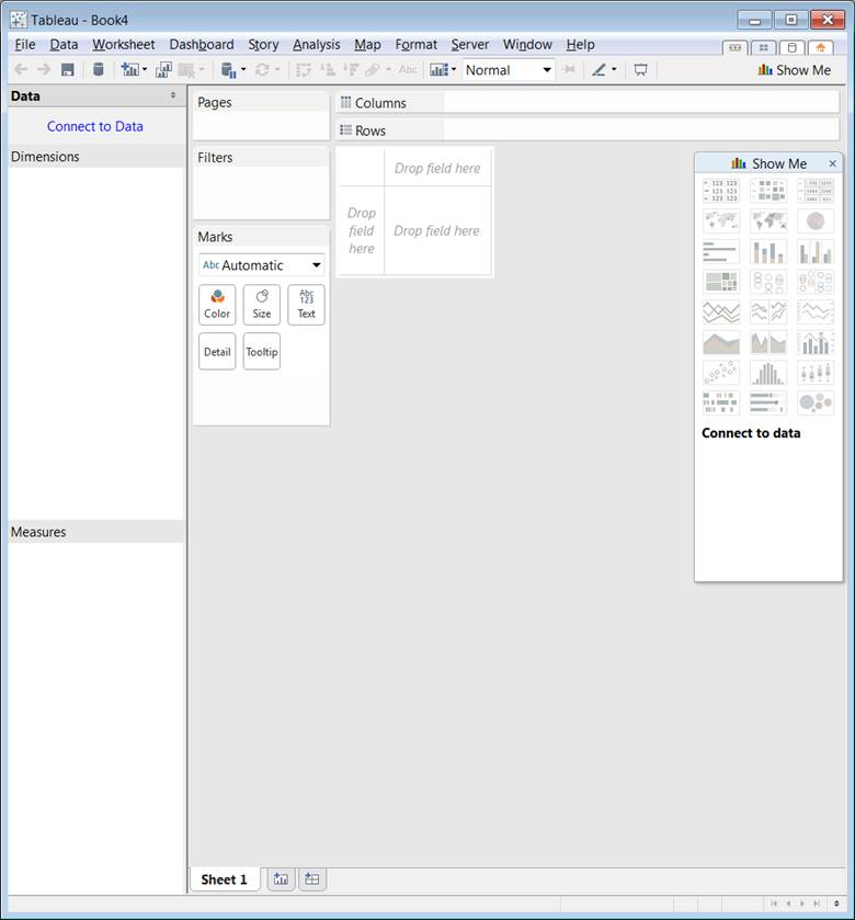
Tableau Desktop supports visual analysis and data discovery, converts the raw information to easy to understand graphical format with interactive charts. No coding is required to create rich visualization.
Tableau Business Intelligence toolset have a Desktop, Server and Cloud version (none open-source products but as good as worth a post on the open-bigdata blog).
In this post I check its Desktop evaluation version that let us connect to many data sources (including Hadoop, MySQL, Excel, Text, …).
I will use the same Weather.Csv as in the Hadoop analysis tutorial.
www.forbes.com:
The next Excel.
Text editor + spreadsheet + visual analysiswww.gartner.com:
Tableau is a self-contained BI platform with data mashup capabilities and direct data connectors, is one way to move when you are hitting the limits with Excel.
?Tableau has the intuitive, visual-based, interactive data exploration experience that customers love to use and competitors love to imitate.
Let?s do the same type of charts that has been showcased as a HTML+JS example in the weather
analysis tutorial. Now there will be no programming exercises, all will be done in a matter of some clicks.
However… By using Hadoop and query languages we can analyze Petabytes of Data and have a plot drawn while with Tableau Desktop only a single node data analysis is possible, so the dataset must be lot smaller than the Petabyte scale of Hadoop.
Precipitation data with Tableau Desktop
The example using HTML is available in the Weather Hadoop analysis tutorial.
- Start-up Tableau Desktop
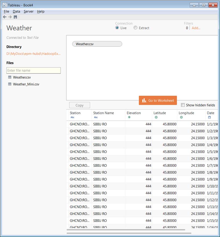
- Click on Connect to Data and choose Text file as source – Input downloadable here
- You can add multiple data sources in File > Open, however we only need the one now
- Click on Load Data and then Go to Worksheet
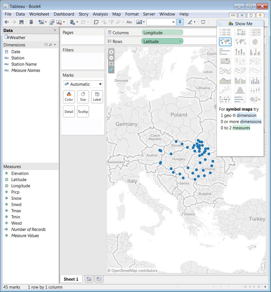
- Add Longitude and Latitude as a Dimension attribute (selectable from drop down by clicking on them after dragged to the Columns and Rows)
- Choose Map on the Show Me Panel
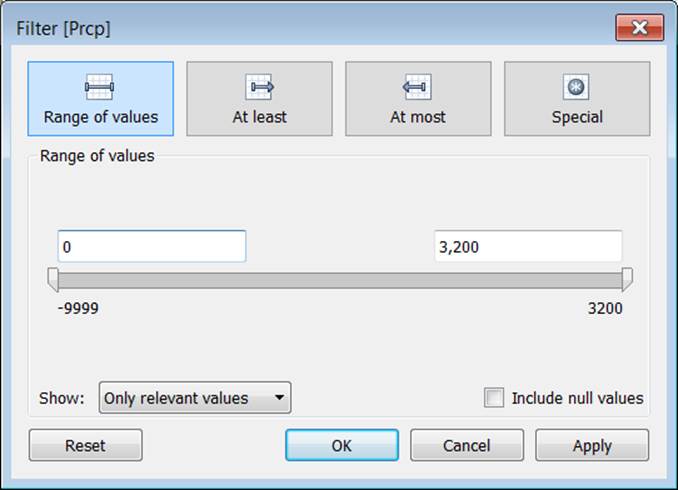
- Add Prcp Measure to the Filters (by drag and drop)
- Get only valid numbers up from 0 in the Filter Tab as the CSV contains -9999 where no measurement data is available those are eliminated
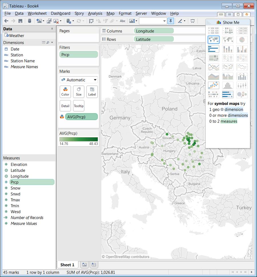
- Add AVG(Prcp) to the Marks AVG is selectable by clicking on the right on the Prcp mark after dragging it to Marks by selecting Measures > AVG
- Click on the left side of it, choose Color to have a Color scale auto assigned dependent on the value of the AVG
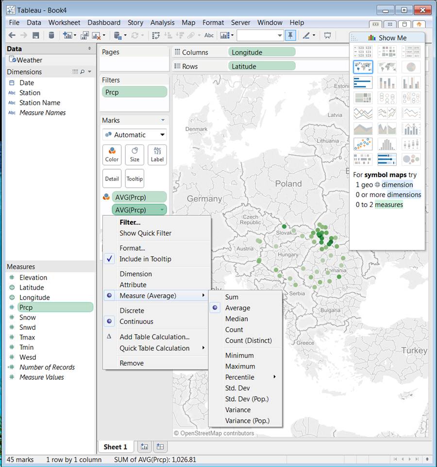
- Do the above again (Add AVG(Prcp) as mark)
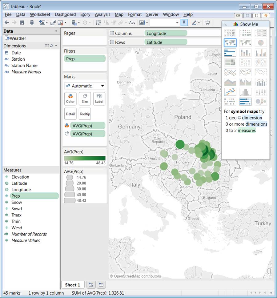
- Now click on the left side of the second AVG(Prcp) mark and choose Size as a Mark Factor
This way not only color coding but size became a differentiating factor too
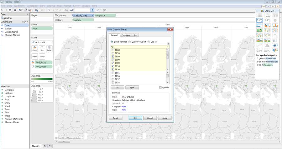
- Add Year to the Columns values
- Click Filter on the right
- Add *0 as a Filter regular expression, that way we will check every decades only so as in the HTML example
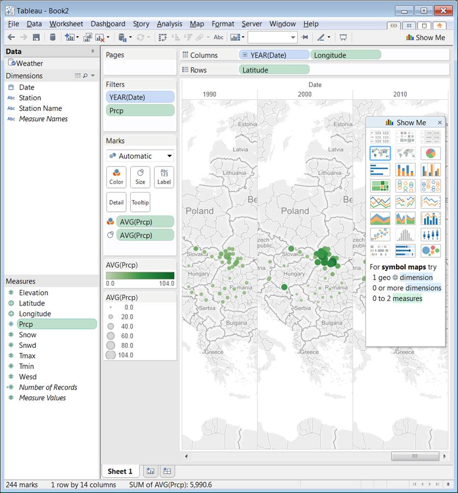
- As a result we can scroll through the decades of AVG(Prcp) / given year
(non-decade based AVG but AVG for specific year shown, scrollable by decades)
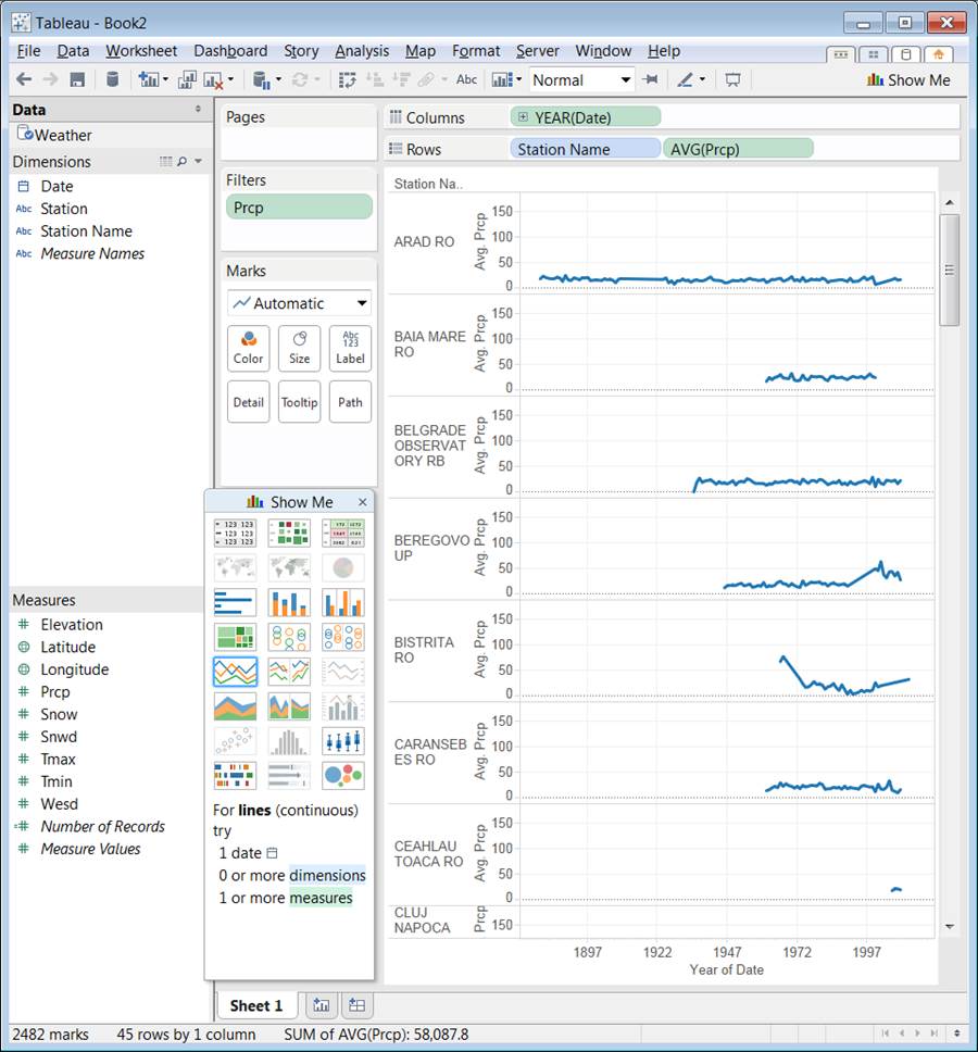
- To generate the AVG(PRCP)/year for each station, this screenshot tells all steps
- Add Year to Columns
- Add Station Name and AVG(Prcp) to Rows
- Add PRCP filter to filter non-applicable -9999 values out, so as in the above example
- Choose the Continuous Line Diagram type on the Show me panel